
If you find that the traditional Winter palette is too bright for your coloring, but the Summer colors are too washed out or low contrast, you may be a Soft Winter.
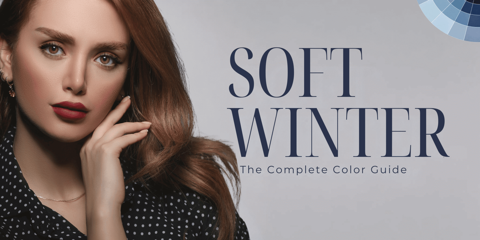
Soft Winters are essentially cool, deeper, more desecrated colors that fall somewhere in between the bright Winters and the muted Summers. This palette is perfect for people who need coolness in their coloring but cannot handle the extreme contrast of a standard Winter palette.
In my years of doing color consultations, Soft Winter is one of the most overlooked palettes — mostly because it simply doesn’t appear in every color system, and plenty of people get talked into a Summer or Winter palette that never quite feels right.
It’s vital to note, however, that Soft Winter is not a universal color-analysis category. The 12-season systems usually feature only three Winters (Deep, Cool/True, and Bright) and a handful of neutrals. Soft Winters appear in some 16-season systems and other variations of color analysis.
Therefore, it’s best not to think of Soft Winter as a specific diagnosis but rather a color direction. What that means is that if you find yourself gravitating towards cool, muted, and less contrasting tones, you may be a Soft season.
This guide will explain the Soft Winter color palette in detail and provide you with styling and makeup tips, as well as explain the difference between a Soft Winter and a Soft Summer.
What Is a Soft Winter Color Palette?
Soft Winter is defined by the combination of three characteristics:
- Medium-dark to dark value
- Moderately muted to muted chroma
- Cool temperature
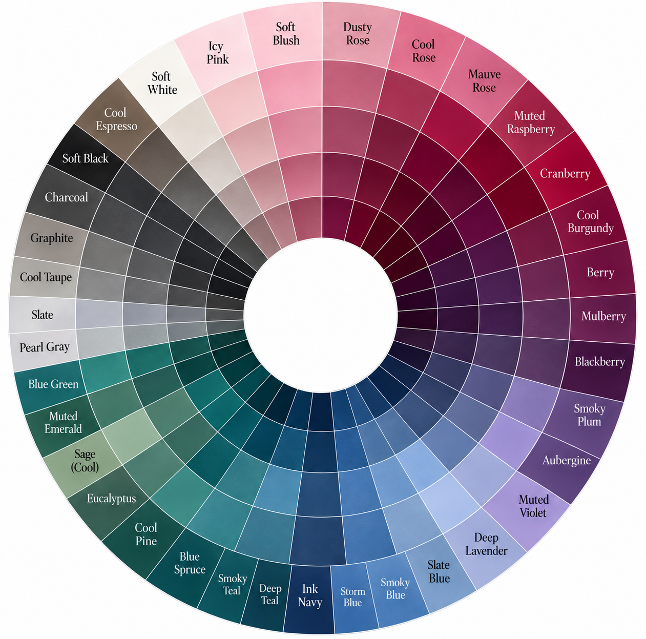
In short: Soft Winter is a cool-toned, medium-to-dark, moderately muted color palette — sophisticated and smoky rather than icy or bright. It sits between traditional Winter and Soft Summer, ideal for anyone who finds Winter too stark and Summer too pale.
This creates a palette that is cool and sophisticated, muted rather than icy, neon, or super-saturated.
Colors such as:
- Charcoal
- Graphite
- Ink navy
- Blackberry
- Cool plum
- Smoky teal
- Blue spruce
- Cranberry
- Muted raspberry
- Cool espresso
- Soft black
- Icy-but-soft pink
…are all cool, sophisticated, deep, and muted.
Some expanded color-analysis systems actually define Soft Winter as falling between Soft Summer and the traditional Winter palette. It’s especially helpful for people who find that neither Summer nor the traditional Winter palette accurately accounts for the way colors look against their features.
Soft Winter Color Palette at a Glance
| Color characteristic | Soft Winter direction |
| Temperature | Cool to neutral-cool |
| Depth | Medium-deep to deep |
| Chroma | Soft to moderately muted |
| Contrast | Medium rather than extreme |
| Overall appearance | Cool, smoky, sophisticated |
| Best neutrals | Charcoal, graphite, ink navy, soft black |
| Best accent colors | Blackberry, cranberry, smoky plum, muted raspberry |
| Best greens | Blue spruce, smoky teal, cool pine |
| Best blues | Ink navy, slate blue, smoky blue |
| Usually difficult | Warm camel, orange, rust, neon shades, very yellow-based colors |
These characteristics should be treated as a starting point rather than a strict rule book. Personal color analysis is based on how colors interact with an individual’s coloring, and different systems define their seasonal boundaries differently.
The Soft Winter Color Palette in Detail
The easiest way to understand Soft Winter is to forget about colors — and think about temperature, depth, and clarity instead.
For example, blue can appear in many different shades. A bright cobalt blue, a dusty blue-gray, a deep ink navy, and a warm turquoise can all technically be called “blue,” but they behave very differently next to the face.
Seasonal color analysis is about temperature, depth, and chroma (clarity) rather than simply named colors.
1. Soft Winter Neutrals
The neutrals are the building blocks of a wearable wardrobe. For Soft Winter, consider:
- Charcoal
- Graphite
- Soft black
- Ink navy
- Cool espresso
- Slate
- Blue-gray
- Cool taupe
- Pearl gray
These shades provide nice depth for Soft Winter without the extreme contrast of a true Bright or Cool Winter palette.
Best everyday neutral combinations:
- Charcoal + dusty rose
- Ink navy + smoky blue
- Soft black + muted raspberry
- Graphite + icy pink
- Cool espresso + blackberry
These combinations create visual depth while maintaining a softened appearance.
2. Soft Winter Pinks
Pink can be a wonderful color for Soft Winter, as long as it’s cool-toned and slightly desecrated. Consider:
- Dusty rose
- Cool rose
- Muted raspberry
- Berry pink
- Soft cranberry
- Mauve-berry
- Cool blush
Avoid warm, peachy pinks just because the color is technically “pink.” If a pink leans yellow or orange, it’s warm — and that works against the Soft Winter palette.
3. Soft Winter Reds
Soft Winter reds are usually best with a blue or berry cast rather than an orange base. Try:
- Cranberry
- Blue-red
- Raspberry
- Berry
- Soft burgundy
- Cool wine
- Mulberry
If the red you’re trying looks more like tomato, coral, orange-red, or terracotta, it’s straying from a true Soft Winter look.
4. Soft Winter Purples
Purple is one of the easiest colors to work with if you’re building a Soft Winter wardrobe. Some of the best shades include:
- Smoky plum
- Blackberry
- Cool aubergine
- Muted violet
- Soft berry-purple
- Deep lavender
- Dusty orchid
These colors are great if you want to add variety to your outfits without relying on black and navy.
5. Soft Winter Blues
Blue is another popular direction for Soft Winters. Once again, it’s best to go for deeper, more subdued hues:
- Ink navy
- Slate blue
- Smoky blue
- Blue-gray
- Deep muted blue
- Soft sapphire
- Storm blue
If you’re looking for a softer dark shade of blue, consider ink navy or slate blue — both are similar to black but slightly less harsh.
6. Soft Winter Greens
Greens should lean cool rather than yellow. Try:
- Smoky teal
- Blue spruce
- Cool pine
- Deep eucalyptus
- Muted emerald
- Blue-green
- Dark sage with a cool cast
Avoid strongly yellow-green shades like chartreuse, lime, and warm olive. These aren’t “bad” colors — they simply carry warm undertones that clash with the cool Soft Winter palette.
Soft Winter Colors to Avoid or Use Carefully
No color is completely off-limits — just less likely to enhance your look because it falls outside your seasonal palette. Colors to approach carefully in Soft Winter include:
- Orange
- Rust
- Warm corals
- Mustard
- Golden yellow
- Camel
- Warm beige
- Tomato red
- Bright neon shades
- Very yellow greens
- Very vibrant jewel tones
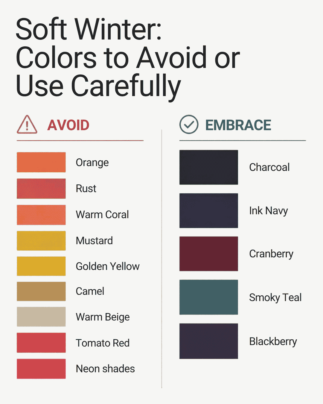
The most important distinction is warm versus cool. There isn’t a huge difference between the Soft Summer and Soft Winter palettes overall — Soft Winter simply carries more contrast and leans darker rather than lighter.
Soft Winter vs. Soft Summer
This is one of the most important distinctions to make when identifying a Soft Winter.
Here’s where it gets tricky: Soft Summer and Soft Winter can look remarkably alike at first glance. Both palettes feature cool, muted, sophisticated colors with relatively low contrast, and both can include neutral, blended tones. But a Soft Winter usually needs more contrast than a Soft Summer. Soft Summer tends to sit lighter and airier, while Soft Winter can carry deeper shades such as:
- Charcoal
- Ink navy
- Blackberry
- Smoky plum
- Deep teal
- Cranberry
A good test to tell the two apart is holding up two shades of the same color and seeing which looks better on you. The Soft Winter equivalent of dove gray is charcoal gray; of light blue is navy blue; of mauve is blackberry; of soft dusty pink is cranberry. If your face looks more defined in the stronger, richer shade, that’s likely your palette.
Just remember — a single color test isn’t enough on its own to determine your season.
Soft Winter Compared to Traditional Winter
This is the other key distinction to understand.
Traditional Winter colors are usually cool, sharp, high in contrast, and generally vivid and saturated. Common examples include blacks, whites, cobalt, emerald, fuchsia, blue-based reds, and icy shades.
Soft Winter, by contrast, leans muted, smokier, and more blended.
Traditional Winter: Clear, crisp, high contrast, saturated, dramatic
Soft Winter: Softer, smokier, more blended, moderately deep, less visually aggressive
For example:
- Pure black → Soft black / charcoal
- Cobalt → Smoky blue
- Bright fuchsia → Muted raspberry
- Emerald → Smoky teal
- Pure white → Pearl or soft cool white
This is exactly why someone with Winter coloring might still feel overwhelmed by classic, intense Winter colors — their palette may actually be Soft Winter.
How to Determine Whether Soft Winter Colors Could Work for You
Color analysis should ideally be carried out through comparison — in a controlled setting or a proper draping test — rather than relying on a single characteristic. Even so, a few indicators can point you in the right direction.
You might be a Soft Winter if:
- Cool tones tend to blend more harmoniously than warm tones on you
- Extremely bright colors seem to overpower your look
- Very pale Summer shades tend to wash you out
- Charcoal blends better on you than very pale gray
- Ink navy blends better than pale blue
- Berry tones blend better than orange-red
- Smoky teal blends better than bright emerald
- Black is fine, but stark black-and-white combinations can feel too harsh
- Moderately dark colors suit you better than very pale ones
- Warm camel, orange, rust, and golden yellow feel like they’re wearing you, rather than the other way around
None of these are definitive proof on their own. That’s why seasonal color analysis is best understood as a styling methodology rather than a clinical diagnosis — and why different systems may place the same person into different categories.
Soft Winter Wardrobe: What Should You Buy?
If Soft Winter has become the theme of your wardrobe, there’s no need to swap out your entire closet. Begin with the items you wear most often.
Start with your neutrals. Aim for roughly:
- 1 charcoal coat or blazer
- 1 ink navy sweater
- 1 soft black trouser
- 1 graphite skirt or pants
- 1 cool gray knit
- 1 dark neutral handbag
- 1 pair of cool-toned shoes
Then move on to accent colors.
Accent pieces to consider:
- Blackberry cardigan
- Cranberry blouse
- Smoky teal sweater
- Muted raspberry top
- Deep plum dress
- Slate-blue shirt
This gives you a wardrobe where every piece can be mixed and matched.
7 Soft Winter Outfit Color Combinations
1. Charcoal + Dusty Rose Charcoal gives the outfit stability, while dusty rose adds lightness. Try: charcoal pants + dusty rose knit + silver jewelry.
2. Ink Navy + Cranberry A rich alternative to classic navy-and-red. Try: ink navy pants + cranberry blouse + charcoal coat.
3. Soft Black + Blackberry A single-family, berry-based look. Try: soft black jeans + blackberry sweater + cool-toned accessories.
4. Graphite + Smoky Teal For something more colorful but still muted. Try: graphite pants + smoky teal top + charcoal bag.
5. Cool Espresso + Muted Raspberry A softer alternative to black-and-pink. Try: cool espresso pants + muted raspberry blouse.
6. Slate Blue + Pearl Gray A light, neutral Soft Winter combination. Try: slate blue sweater + pearl gray pants + silver jewelry.
7. Blackberry + Ink Navy A more mature, polished pairing. Try: blackberry dress + ink navy coat + cool metallic accessories.
Soft Winter Makeup Colors
Your clothing palette isn’t the only place this color direction matters. For makeup, think cool or neutral-cool shades that aren’t overpowering.
Blush: Cool rose, dusty pink, berry pink, mauve, soft raspberry
Lipstick: Rose, berry, cranberry, cool mauve, raspberry, soft wine, plum-rose — avoid very orange-based coral or warm terracotta shades, which can run too warm.
Eyeshadow: Taupe, cool brown, charcoal, smoky plum, slate, cool gray, soft mauve
The goal isn’t to make everything gray or purple — it’s to stay within a cool or neutral-cool palette that complements your natural coloring.
Soft Winter Hair Colors
Hair color is another place where temperature matters. If you’re considering a change, look at cool or neutral shades such as:
- Cool dark brown
- Neutral espresso
- Soft black
- Ash brown
- Cool brunette
- Deep neutral brown
Avoid golden or copper tones, which can make your face appear too warm by contrast.
That said, hair color advice shouldn’t come from a chart alone — your natural hair density, skin coloring, care routine, and desired contrast level all factor in too.
Soft Winter Jewelry & Accessories
Cool metals tend to suit Soft Winters best:
- Silver
- White gold
- Platinum
- Mixed metal jewelry with cool highlights
For accessories, try charcoal handbags, ink navy bags, blackberry scarves, cool gray shoes, silver hardware, and smoky teal accents. Accessories are a great low-commitment way to experiment with the Soft Winter palette before investing in a full wardrobe shift.
Can Soft Winter Wear Black?
Yes — but the more useful question is how much black works for you.
Soft Winters can often wear dark neutrals, including black, comfortably. Some find that a slightly softer neutral — charcoal, graphite, or ink navy — is more flattering near the face than pure black.
If black feels a touch too intense, try moving along this scale: soft black → charcoal → graphite → ink navy. This gives you the illusion of black without quite so much harshness.
Can Soft Winter Wear White?
Optic white is closely linked to traditional Winter palettes. For something softer, try:
- Pearl
- Soft cool white
- Frosted white
- Very pale blue-gray
You can still wear brighter whites — just use them sparingly or pair them with darker colors. For instance, soft white + charcoal reads far less stark than optic white + black.
Soft Winter Nail Colors
Nails are an easy, low-commitment way to test a palette before committing to a full look.
Everyday: Cool nude, pink-beige with a cool cast, dusty rose, mauve, soft taupe
Statement: Cranberry, blackberry, deep plum, muted raspberry, cool burgundy, smoky teal
Minimal manicure: A sheer cool pink or muted rose makes a great everyday choice that won’t compete with the rest of your outfit.
Soft Winter Capsule Wardrobe
To build this palette into a capsule wardrobe, start with approximately:
5 neutrals: Charcoal, graphite, ink navy, soft black, pearl gray
5 accents: Blackberry, cranberry, smoky teal, muted raspberry, smoky plum
3 lighter hues: Cool blush, soft lavender, pale blue-gray
From these 13 pieces alone, dozens of outfit combinations become possible without buying an entirely new wardrobe.
The Most Common Soft Winter Mistakes
Mistake 1: Assuming every “Winter” color works for you. Cobalt, neon pink, and highly saturated emerald are technically Winter colors, but their intensity doesn’t suit Soft Winter.
Mistake 2: Reaching for warm neutrals. Camel, warm beige, golden brown, and orange-brown carry a warm undertone that clashes with the cool base of Soft Winter.
Mistake 3: Going too light. Soft Winter can include lighter accent hues, but the overall palette shouldn’t be washed out. “Soft” refers to chroma (saturation), not value — a true Soft Winter palette still needs depth.
Mistake 4: Confusing “muted” with “warm.” A muted color can absolutely be cool-toned — dusty rose and smoky blue are perfect examples. Muted simply means desecrated, not warm.
Mistake 5: Trusting an online quiz as the final word. A quiz is a fine starting point, but it can’t replicate the nuanced comparison of an in-person or professional color analysis. Your palette should ultimately be based on what actually looks best on you.
How to Do a Soft Winter Test at Home
You can run a simple Soft Winter test at home by comparing two shades of the same hue. Do this outdoors on a cloudy day, with minimal makeup and a neutral-colored top. Compare:
- Depth: Dove gray vs. charcoal
- Blue: Powder blue vs. ink navy
- Red: Tomato red vs. cranberry
- Pink: Warm vs. cool dusty rose
- Green: Warm olive vs. smoky teal
Watch how each color affects your face. Does your skin look more even-toned and healthy? Do your eyes stand out more? Does your face look less flushed or less shadowy — more balanced overall?
Focus less on how the color looks on its own, and more on how it makes you look. That’s the entire point of color analysis.
Final Soft Winter Color Palette
If you want the simplest possible shopping reference, here are the most wearable colors for Soft Winter:
Neutrals: Charcoal, graphite, ink navy, soft black, pearl gray
Pinks: Dusty rose, cool rose, muted raspberry, berry pink
Reds: Cranberry, blue-red, cool wine, berry
Purples: Blackberry, smoky plum, cool aubergine, muted violet
Blues: Ink navy, slate, smoky blue, blue-gray
Greens: Smoky teal, blue spruce, cool pine, deep blue-green
Avoid: Camel, rust, orange, warm coral, mustard, golden beige, neon shades
Final Thoughts
I see Soft Winter as a cooler, less intense variation of Winter — one that’s genuinely underrepresented across most color-analysis systems.
If you’ve found that your warm colors read too yellow and your cool colors feel too washed out, it may be worth exploring what Soft Winter has to offer.
Start with the colors that show up most consistently across this palette — charcoal, ink navy, blackberry, cranberry, smoky teal, cool rose, and graphite. Once you’re confident with the basics, experiment with different levels of saturation and depth.
And remember: your seasonal palette is a guide, not a rule book. If a color outside your season genuinely complements you, there’s no rule against wearing it. The real purpose of seasonal color analysis is simply to narrow down where to start looking.
Not sure which season you actually are? Explore our full Color Analysis guides, or browse seasonal outfit ideas to see these palettes in action.
FAQ
Is Soft Winter part of the 12-season color test? Usually not. The standard 12-season system typically includes only Deep Winter, Cool/True Winter, and Bright Winter. Soft Winter tends to appear in 16-season systems and other variations.
Is Soft Winter a cool or warm season? Soft Winter is mostly cool or neutral-cool. It’s distinguished from warm seasons by its cool, rather than warm, base.
Is Soft Winter the same as Soft Summer? No. The two share muted, cool colors, but Soft Winter carries more definition and depth than Soft Summer.
Can Soft Winter wear black? Yes — though charcoal, graphite, or ink navy often flatter more than pure black.
Can Soft Winters wear brown? Yes, but a cool brown tends to work better than a golden, caramel, or warm orange-toned brown.